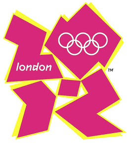
2012 Olympic Logo
 Many people are talking about the official logo for the 2012 Olympic games. Do you like it? A lot of people don’t care for it, and I’d have to say I’m one of them. It looks like some kind of robot that’s falling apart. It was designed by a professional design group at a cost of $1 million. Yes, $1 million!!! That’s crazy!
You can watch the launch video here. However, the animated film the logo is used in to promote the games has triggered epileptic seizures.
Since so many people are unhappy with the logo, will they change it? I’m not sure how that works but I’m guessing since they already paid $1 million for it, this is it.
5 Comments
Leave a Reply
You must be logged in to post a comment.

The Olympics are a cash cow…people all want a piece…then after the feeding frenzy is over, no one cares. Entities care more about being attached to the Olympics than the Olympics themselves.
The logo itself isn’t that bad…but it did take a minute to figure out that is a 2,0,1 and 2.
It’s different…I will give it that.
check this out and the comments: http://hiteshmehta.in/?p=14
Even if I am not paid so much for my works, I can 100% say that this is a very bad work.
It reveals nothing about olympics. Only about stupidity of that designers and those who paid them.
Hey, I can make a logo like that! I can’t believe they got paid $1 million for it!!!!!
What do those colors have to do with the Olympics?
The Beijing logo is simple, understated and it says “China, Olympics and 2008” without being showy.